How To Prepare Your Excel Data For Analysis | 5 Common Mistakes To Avoid

If you’ve ever tried to load your Excel data into a data analysis tool but got an error message or you’ve found that the data you loaded isn’t working as you thought it would. Then it’s probably down to the way it’s structured or formatted. In this article, I’m going to talk about the 5 most common mistakes to avoid and how to prepare your data for analysis in BI tools.
Over the years, I’ve met with hundreds of people and their data. Lots of them new to BI and data analysis and used to working with Excel. But when it comes to loading Excel data into a BI tool, there are some common mistakes that I see people make time and again.
Some think that all they need to do to start analysing their Excel data is just to load the file as it is into their BI tool and hope that the tool is magically going to read and understand its contents.
Unfortunately, although the technology of BI tools has come a long way, we’re not quite there yet.
There is a certain structure the data needs to have and rules that need to be followed to make sure that it’s ready and optimised for analysis. Let’s dive in and take a look.
Tabular format
First off let’s talk about some data structure basics. In order to analyse your Excel data in a BI tool, it needs to be in a tabular format. But not in just any kind of table.
It needs to be structured in rows and columns where each column contains a column header in the first row that tells you what data is contained in that column. This will be a specific, unique metric or dimension. Then each row should contain a record of the data.

So, that’s the way it should be structured. But, over the years, there are some common mistakes that I see come up time and time again. Let me break down the 5 most common ones for you.
1. Data is already aggregated
The first common mistake I see is that the data contained in the Excel file has already been aggregated using a different tool like a pivot table. Something like this…

This data is in a table but there are 3 warning signs that indicate that it isn’t in the correct format and structure. Firstly, there’s more than one header row. Secondly, the data doesn’t start in the first row and thirdly, you have column headers that repeat - in this case, the sales regions.
So, even if the data did start in row one, column one, it still wouldn’t be compatible with BI tools.
This is what the data should look like…

In fact, this is the raw data that the previous aggregated table comes from. Raw data is data at its most granular level, meaning that it can’t be broken down any further. You can see that each column contains a unique data point and each row contains a record of the data.

2. Double/triple counting
Going back to the previous aggregated data for a second, there’s actually a 4th warning sign that, although it wouldn't stop the data from being successfully loaded, it would give you erroneous results. And that is the total rows.

Here we have both subtotal and grand total figures. So, if I select all the values, you’ll see that the sum is actually 3 times what it should be because we’re triple counting the numbers. So that’s another thing to avoid, total rows.
3. It’s the wrong orientation
Another common problem I see that often happens with data that’s been exported from some system or other is that the data is in the wrong orientation. As I mentioned a moment ago, the data needs to have each column as a metric or dimension and then each row as a record of the data.
However, if we look at the example data below, we can see that each column contains just a single date of information.

So when it’s loaded into a BI tool, you’ll have a separate field available for each date. Like you can see here.

This format of data is fine for working with in Excel. I could just select it, choose ‘insert chart’ and select a time series chart. Excel will recognise that there are dates and configure the chart to match the data in the table.
However, in its current structure, I couldn’t create the same chart in a BI tool because I’d need a single date field to break down the metric for each of the products.
So in order to fix this and turn the data up the right way, you would need to transpose it. To do this in Excel is super easy. Just select the table and choose copy. Then go to edit>paste special. And hit the transpose checkbox and click ok.

You should, of course, paste the data into a brand new sheet in cell A1 if you’re going to load it into a BI tool.
This is the structure we’re looking for with the products at the top and the date in a single column. What you will need to do, however, is to rename this column as date.

If you select this new table and insert the same chart, you’ll see it’s identical to the one before because Excel knows what it’s looking at.
And if you go into your BI tool, you’ll see that you can create a similar chart.
But, because of the way the data is now structured, we have to add each product individually into the query, which isn’t ideal.

Which actually brings me on to my next common mistake I see when it comes to structuring your Excel data.
4. It needs to be stacked
Let’s take the data table we just created using the transpose function in Excel and I’ll explain.
As we just saw, the data will load into a BI tool without any errors but this, in itself, doesn’t mean it has the structure necessary for us to analyse it the way we want to.
To fix the problem we just talked about where we can’t add more than one product to the pivot table, we would need to do a bit of surgery on the data. In this case we’d need to stack the data. Let’s construct our new stacked data below here.
First, I’m going to take the date and product 1 columns and paste them below. What I need to do now is to take the product 2 data, along with the date, and paste it under product 1. Then we do the same for product 3. And product 4.
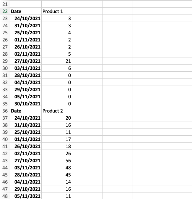
Now we have just 2 columns, one containing the date and one containing the scores for the 4 products for each of the dates.
But we’re not finished, because we still have 2 more things to do.
First, we need some way to identify which product the score should be attributed to in each row. For this we’ll need to create a new, third, column we’ll call Product and then enter the product name for each row. Like so…
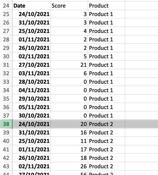
Great. The second and last thing to do is to remove the old column headers from the rows.
And there you go. You now have a data source that is structured correctly for analysis in your BI tool.
5. Wrong date formats
The final issue that can arise relates to the date fields in your data. If you’ve worked with Excel for a while, you’ll probably be aware that there are loads of different date formats available to choose from.
Lots of them make distinguishing between months and days easy. But some do not. For example this date - 3/2/2022 - will mean 2 different dates depending on where you live.
Most of the world would see this date as the 3rd of February but, to Americans, it is the 2nd of March. So how will your BI tool read it? Well, unfortunately for us non-Americans, the answer, more often than not, is the American way.
This can cause, as you can imagine, a fair few problems when you use wrongly read dates in your charts and queries.
For example, this date (13/1/2022) will in fact sometimes be read as the first of January 2023. Why? Because that would be the thirteenth month of the year 2022.
So, how do we make sure that everything is correctly recognised? What format should you use?
Correct date format for Excel?
Well, to be safe, I’d suggest using the ISO 8601 format which is YYYY-MM-DD. It’s the internationally accepted, standardised format and one that’s also used in things like SQL databases.
So, when you use this format, you will guarantee that you won’t encounter any problems with dates when you’re loading your Excel data into your BI tool.
If you don’t know how to format your dates in Excel, just go to Format>>Cells… and Date.
Bonus tip
Those were the top 5 mistakes to avoid and here’s a quick bonus one. Avoid blank rows in your data. So rows where the data stops and then continues again. In some BI tools, blank rows are what indicates to the tool that the data has ended and to stop reading or importing it. So if you find that not all the data is being reported in the tool, blank rows are something you should check for.
Watch on YouTube
If you liked this article, why not check out the video version on Youtube below.