
7 Data/Looker Studio Hacks Everyone Should Know

If you’re a Data Studio user looking for ways to speed up your reporting workflow whilst getting the most out of the tool, I’ve got 7 pro tips and hacks to help you do just that.
Watch the video:
1. Report-level settings
Either from the file menu or simply by right-clicking a page of the report, you can access the “Report Settings”.

In these global settings, for example, you can add a filter that will apply to the whole report (or a Google analytics segment if you’re working with a Google Analytics data source). This saves you from having to add the same filter to each individual widget or page in the report.
The same goes for date ranges. You can set a custom date range that will be applied to the whole report.
If you’d like to be able to share filtered versions of a report or allow your report viewers to do so, you can activate custom bookmark links.
How does this work? Well, in view mode, when the viewer applies filters via controls in the report, their filter selections will get added to the URL of the report as parameters.
If you then copy and paste this modified URL into a new tab, you can see that the report loads with the filters pre-applied.
This functionality is great for being able to share different versions of the same report with different people.
Obviously, the data isn’t secured and any viewer can simply unfilter the report to see all the data. But it’s really useful for if, when you’re working with a report, applying filters, and you find some interesting insights that you’d like to share, you can just share the custom URL instead of downloading a pdf, sending a screenshot etc.

Finally, on report settings, you can enter your Google Analytics measurement IDs. By doing this, you’ll be able to see things like how many times your report has been opened and where your users are coming from.
You can add 1 Universal Analytics AND/OR 1 GA4 ID and you should start to see data coming through after 24 hours.
Quick bonus hack, you should also be aware that you can apply filters and a custom date range to individual pages as well just by right-clicking the page and selecting “Current page settings”.
2. Report-Level Elements
As well as being able to have global report settings, you can also have global report elements. This means that they’ll be added to each page of the report, either existing pages or when you add new pages.
So, if I were to add a rectangle to the top of the page and perhaps add some text. Then I select these 3 elements (including the filter control), right-click and select make report-level. Now, when I add a new page, we can see that those elements have been automatically added.

One thing to note is that the elements will remain in the same place for all pages. If you were to move an element on one page, that change will also be applied to all other pages.

3. Pasting styles
Next up is a great time-saving hack for when you’re designing your dashboard and applying styles to widgets.
Here I have 4 scorecard widgets and one of them has different style options applied. If I wanted to apply those same options to the other 3 scorecards, I would just need to select the first one, choose copy either from the editing menu or by using your keyboard shortcut.
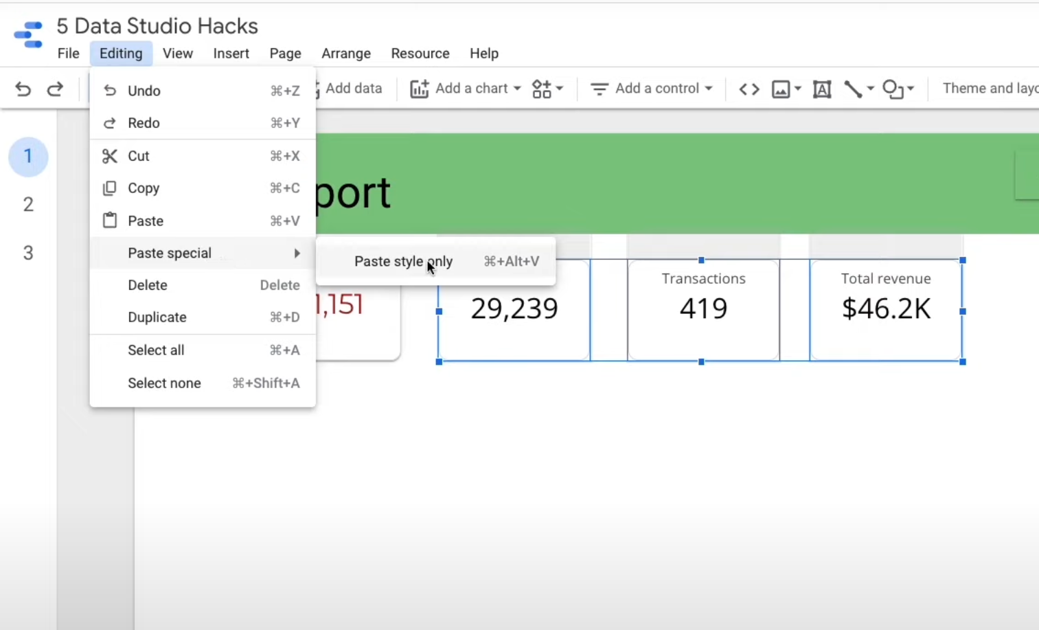
Then I select the other 3 and choose Editing>Paste special>Paste style only. Voilà.
4. Bulk Editing
This next hack is actually another way that makes applying the same options to multiple widgets even easier.
If I wanted to change something on all of my scorecards, for example, I would just need to select one scorecard then right-click, Select>Scorecards on page. That will select all of the scorecards.

Now, I can not only change the style options in the style tab but also in the setup tab, I can change the data source they’re taking data from and apply a custom date range as well.
I can even apply a comparison date range that will be applied to all of the scorecards at the same time.
Do note that the bulk editing options available will vary depending on which visualisation type you’ve selected.
5. Widget alignment
Another quick hack at your disposal when you’re working with multiple widgets like these scorecards is the options you have for aligning and distributing them.

Here you can see that they are scattered at the top of the page. If I wanted them to all be in alignment, I can just select the 4 scorecards, right-click and choose Vertical alignment (top) and there you go.
Then, if you wanted them spaced out equally, I can right-click, and choose Distribute>Horizontally.
6. Chart-specific filters
Hack number 6 is one that’s great if you want to have the filter controls in your report only apply to certain widgets.
Here I’ve added a new filter control for Device Category. Then I select the filter along with the 2 widgets, right-click and choose “Group”.

Now, when you apply a filter, you will see that it only affects those widgets that the filter is grouped with.
One thing to bear in mind, however, is that this grouping doesn't work when you’ve got a report-level filter control. You would need to make that filter page-level instead.
7. Blending widgets
This last hack is probably the most powerful of the bunch and is used when you have 2 charts containing data that you want to blend together but the data source won’t let you. Here’s an example:

In this report, I have 2 column charts. Both contain sessions by page title coming from a GA4 data source, with the one on the right being filtered on organic traffic. What I’d like to do is to have both results combined in the one chart, side-by-side. Normally, to do this I would create a filtered metric using the CASE function:
CASE WHEN Sessions default channel grouping = 'Organic' THEN Sessions ENDBut, as you’re probably well aware if you’ve ever tried this kind of thing in a GA data source, that’s not allowed. Because, as the error message tells you, you cannot mix dimensions and metrics in the same formula.
That’s pretty limiting until you realise that you can actually blend these 2 charts together to achieve our desired result.

To do this, we simply select both charts, right-click and choose “Blend data”. Hey presto, a third chart is created combining the 2 series of data. Now I can just delete the 2 original charts and leave the combined one.
The result of this blend is a blended data source that you can see and access from the data sources on the right.

If you’re new to Data Studio and are looking to become highly proficient in using the tool to analyse your data and build interactive dashboards, why not check out my online course here. Or take a 15-minute tutorial here to get you up and running.
Thanks so much for reading, I hope you learned something new today. If you did please share with anyone you know who might find it useful too.