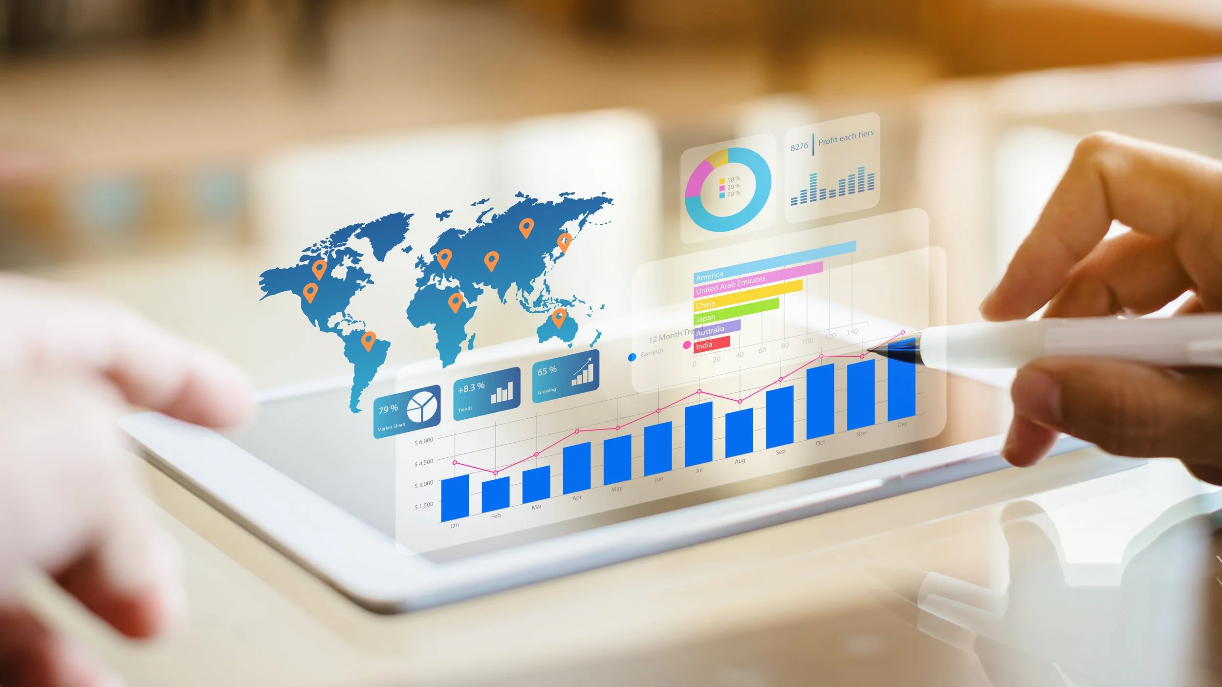
What is Business Intelligence?
There’s often confusion as to what Business Intelligence (BI) is and what differentiates it from data science or just straightforward data analysis.
You’ll often get different answers depending on who you talk to. Database admins will say BI is more about data whereas analysts will say it’s more about analysis and dashboards.
I’ve been working in Business Intelligence for over 10 years and worked on projects for some of the largest companies in the world.
Let’s put this question to bed once and for all and I’ll tell you exactly what Business Intelligence is.
What is Business Intelligence? A Basic definition
Let me start by explaining, in one simple sentence, what Business Intelligence is and then I’ll go into greater depth about precisely what it consists of. So, in its simplest form...
BUSINESS Intelligence is the process of analysing BUSINESS data in order to help make smarter BUSINESS decisions.
Now, I intentionally wrote that sentence in such a way that makes it as easy as possible to differentiate BI from other disciplines such as data science or just general data analysis. The key is in the name, BUSINESS Intelligence.
Whereas data science is the practice of testing theories and making discoveries using data that can be of any nature at all (this could, of course, include business data), the whole point of Business Intelligence is to make a business smarter through data.
So, let’s elaborate on the first simple sentence and add more meat to the bones of what Business Intelligence is…
Business Intelligence is the process, or practice, of harnessing the data that a business generates in all of its various activities.
Then aggregating, analysing and visualising that data in dashboards and reports in order to better understand it and gain valuable insights into how a business is performing.
These insights can then be used to make smarter and better-informed data-driven decisions to help the business evolve and grow.
So, basically, the 3 stages of BI are:
Harness the data
Analyse and visualise the data
Use insights to make smarter decisions
Business Intelligence is an on-going process
Rinse and repeat. I say this because Business Intelligence is an on-going process. You don’t just analyse the data once and make a single set of decisions based upon the insights gained.
Once the first decision - or set of decisions - has been made and implemented, the impact they have on the business’ performance will need to be measured.
This could mean building new data visualisations (charts, graphs, tables etc) to add to your dashboards.
It could even mean building a whole new dashboard.
Or the results of the data analysis could bring with them entirely new questions you hadn’t initially thought of. Or new KPIs to track, that require accessing more/different data sources.
The best Business Intelligence is flexible and constantly evolving to fit the constantly changing situation of the business that is using it.
Now that we’ve defined in general terms what Business Intelligence is, let’s dig a little deeper into each of the 3 parts of the BI process above.
This will help us to understand some of the reasons for both the emergence of BI over the past couple of decades and the purposes it serves.
What is Business Intelligence data?
In today’s modern business world, most companies generate A LOT of data. Gone are the days when all of it was contained in spreadsheets and on-premise databases.
The online age has brought with it things like social media and cloud-based business services. And they all generate tons of valuable data.
But therein lies the biggest challenge that Business Intelligence aims to overcome.
Getting a clear picture
All of this data is separate in what are called ‘silos’, meaning it’s hard to get a global 360° view of how your business is performing in all of its activities without having to look at multiple reports in different places.
And it makes merging data from different sources very complicated.
What we really need to do is to bring these various data sources together and analyse them together to get a clearer picture.
Because, in order to answer questions such as, “what impact have my recent social media campaigns had on sales?”, we need to be able to combine data from multiple sources, i.e. your sales data and your social media data.
What is a Data Silo?
A data silo is a standalone source of data that’s not connected to any others or to a centralised data repository.
Basically, most businesses generate tons of data in different places through all of their different activities. From simple Excel files and on-premise databases to social media profiles and web-based SaaS (Software-As-A-Service) services.
You can even have different data silos within the same company in different departments. Sales, marketing, finance, etc could all be using different internal systems that collect data and store it separately from the rest.
One of the basic premises of Business Intelligence is to harness the data from these different data silos and, either use tools to query the data where it is or transfer that data from there to a centralised repository where it can be analysed together in one place.
Check out this article for more Business Intelligence terms that everyone should know.
How to analyse and visualize Business Intelligence data
The end product of the data analysis part of the process usually takes the form of a dashboard (or report) that contains visual representations of your aggregated data.
It will very often, but not always, contain elements of interactivity that will allow the dashboard viewer to ask questions of the data being presented by doing things like applying filters, or changing the metrics or dimensions contained in the visualisations.
Dashboards are so called because they perform similarly to traditional vehicle dashboards.
Whereas a car dashboard displays things like the speed you’re travelling at, how much fuel is left in the tank or even the outside temperature, a BI dashboard contains your business’ metrics or KEY PERFORMANCE INDICATORS (KPIs), like your revenue, stock levels or how much engagement you're getting on social media.
Tracking and benchmarking your KPIs in dashboards allows you to measure your business’ performance. Visualising your data makes it much easier to read, digest and understand.
A dashboard gives you an at-a-glance snapshot of performance and helps you identify areas where you’re doing well and those that might need more attention or investigation.
Data visualisation is a discipline all unto itself - that I go into more detail about in this article - and effective visualisation is key to making sure your data is as easy to understand as possible.
How to gain insights from Business data
So, once we’ve got our data together in one place, analysed and visualised it, we come to the insights stage where it's time to read the results of the analysis and see what, if anything, has been learned.
Data that is visualised effectively can help you spot trends, see how different metrics correlate with each other, spot outliers or unexpected anomalies in the data, and compare different periods of time to see how things are evolving.
It’s these time period comparisons, being able to see simple percentage increases or decreases, that are the most useful in tracking and benchmarking performance.
Now, obviously, every business is different with different KPIs but, to give you an example of the kinds of insights we’re looking for, let’s look at a dashboard that I built containing some real data.
Below is a dashboard containing the some Instagram media data for the tourist office of the town where I live in France.
It’s a fairly small data set but you can see we’ve broken down our main KPIs, the number of posts and average number of interactions, by different things, like month, day, hour, filter and type. And colour data encoding is used to see the 2 KPIs together.
So what can we learn?
If we look at this first chart by month, we can see that in August they posted the most number of times. But we can also tell by the yellow colour that those posts had the least number of average interactions.
So... this could tell us that maybe they posted too much and should think about reducing the number of posts during a month.
OR... simply that it’s a month when a lot of people are on holiday in France so aren’t ON Instagram as much.
One way to test this would be to compare the same month of the previous year and see if the average interactions was also low.
This second chart by day gives us some clearer insights.
We can tell that posts on Tuesday and Wednesday receive the highest average number of interactions so this could tell us that we should post more on those days.
And finally, we can see above that the Amaro filter appears to be most effective in gaining engagement so we could try applying it to more posts to see if interactions increase.
The data visualised in this dashboard gives us ideas and food for thought of things that we could try in changing how and when we, in this case, post to Instagram.
Ideas that we may not have had without having analysed our data. And that’s exactly what we mean by INSIGHTS.
Conclusion
So there you have it. Hopefully, you’ve now got a better idea of what business intelligence is, its challenges AND its benefits.
BI is a process. And it is not more about data than it is about data visualisation or any other part of that process.
Each part of the process is equally as important in helping make businesses smarter through data.


