Simple Segmentation Analysis Tutorial
In this article we’ll be looking at how you can use segmentation analysis to go beyond the basic Business Intelligence processes and dive deeper into your data to gain better insights into your customers, subscribers or users. Segmentation may sound quite fancy but it is, in fact, fairly simple to employ and you don’t need to have any special data science skills or tools. Let’s dive in.
We’ll be discussing what segmentation is, why it’s used and then I’ll show you how to conduct segmentation using a technique known as RFM analysis. Something that can be done using just excel. So I’ll show you how to do that but also, if you stick around until then end, I’ll show you how you can use Google’s free BI tool, Data Studio, to create a more basic version of RFM. Let’s get started.
WHAT IS SEGMENTATION?
So, the basic premise of segmentation analysis is to divide up, for our purposes, our customers into different buckets or segments based on their behaviours and other criteria.
When you’ve got tens or even hundreds of thousands of customers, you can’t analyse them individually. You need some way to categorise and group them. By using data related to how customers interact with your business, you can score each one for different criteria and build up a detailed multivariate profile.
It’s important to use multiple metrics or criteria because, by using just one, you don’t get an accurate picture of that customer. Let me give you an example of 2 separate customers.
The first has made orders with your business totalling $2000, the second only $1000. Now tell me, in your opinion and based on this single piece of information, which customer would you say is more valuable to your business? The first, right?
Ok, so now let me tell you that the first customer made 1 single order over 2 years ago and the second customer has made 4 orders over the past 12 months.
Now, based on these 3 different pieces of information (total value, number and recency of orders) which customer would you say is more valuable? The second, right?
You can now see how, using multiple criteria, you can build up a better picture of your customers.
This example I just gave you is what RFM analysis does. RFM stands for Recency, Frequency and Monetary. It scores the recency, frequency and monetary value of customer orders. This is the practical example we’ll be doing together in a minute.
So that’s what segmentation is, scoring customers for multiple variables and grouping them together based on their scores.
WHY USE SEGMENTATION?
As you can imagine, there are many reasons why you’d want to use segmentation analysis in a business scenario. But the 3 main ones are:
to increase sales
to improve marketing
increase customer retention.
The first two really go hand in hand and speak to the origins of RFM analysis. It was a technique first used to increase the efficiency of direct mail campaigns (you know, actual physical pieces of promotional mail you get through the letterbox).
RFM analysis allowed the marketers to segment their thousands of customers into those who were more likely to convert and purchase based on their previous behaviour. Thus reducing the printing and mailing costs of the campaign and increasing conversion rates and sales.
Obviously, direct mail is far less common than it used to be with the advent of email marketing but segmentation can, of course, be used for that as well.
Another very useful way to employ segmentation is with a subscription-based business model. As it can help to increase customer retention and reduce churn. Again, by using RFM analysis, you can predict when a customer might cancel their subscription.
For example, if a customer hasn’t logged into their account for a while (recency), they’ve opened up lots of tickets with the support team (frequency) suggesting they’re having problems, and their account has a higher than average number of users or MRR - Monthly Recurring Revenue (monetary) then this customer is more likely to cancel than one who logs in every day and has perhaps only contacted support once.
When you know a customer might cancel you can proactively jump in and offer further support or onboarding.
After all, it’s commonly stated that it costs a business, on average, five times more to acquire a new customer than it does to retain an existing one. Meaning that RFM analysis can really help make your business more profitable.
So those are the 3 main benefits of using segmentation. Shall we look at how it’s done? Ok, let’s jump onto my computer and I’ll guide you through it.
EXAMPLE
We’ll be working in Excel and you can download the data set and follow along. As I said, I’ll show you how to do this in Excel first and then we’ll see a simpler version using Google’s Data Studio so don’t worry if you don’t manage to follow the first example all the way through.
We’re going to take this data and, in 2 steps, conduct RFM analysis on it to segment all of our customers. The first step is to aggregate this data so that we have it at a customer level. Currently it’s at an order level with each row representing a single product in an order. You can see that there can be multiple rows per order.
The way to aggregate the data in excel is to use a pivot table. If you don’t know what this is or how to use one, you can check out this tutorial. I’ve gone ahead and created the pivot table so let’s look at what I did.
Aggregating the data using a pivot table.
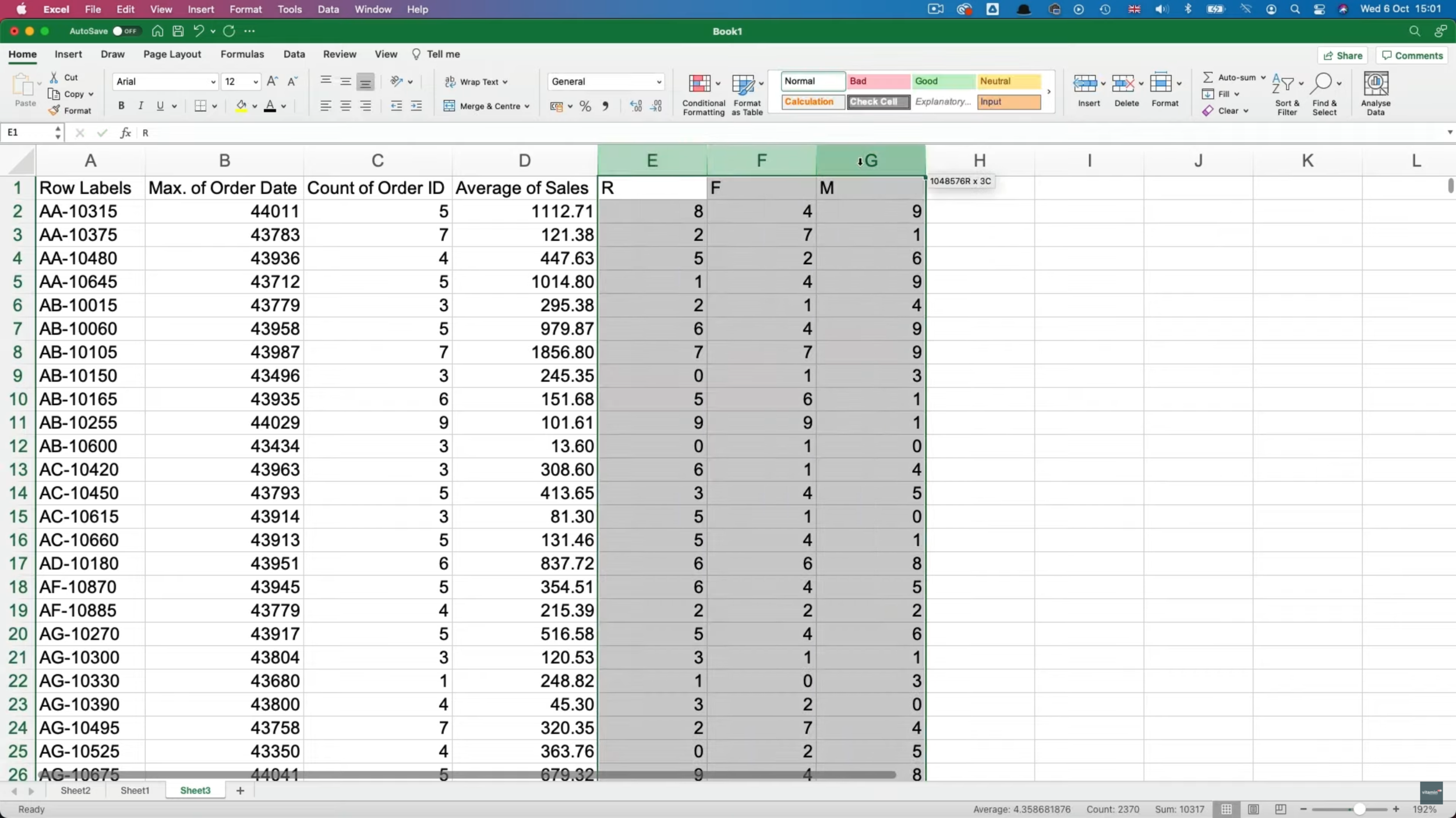
In rows I’ve put Customer ID and in Values I’ve put Order Date and asked for the maximum date, Order ID and asked for the count and for our monetary value I’ve put Sales and asked for average. You can use average or sum for the total value of orders as well, it’s up to you. When you add your max date, you may need to format it as a date by going to Format>>Cells and choosing a date format.
Once your data looks like the above image, select it all (cmd or ctrl + A) and copy it. Then, in a new sheet, go to Paste special>>Values. You can reduce the decimals on average sales if you like. You don’t have to but it just looks neater to me. You’ll may notice that the date has reverted back to a number but don’t worry about this, it’s not important.
The next step is to assign a value, or bucket, to each of the customers for the 3 columns.
You can create as many or as few buckets as you like but the method we’re going to be using in Excel assigns a percent rank for each value based on where it ranks between the minimum and maximum values in the column.
We’ll then format this value to be an integer between zero and nine, giving us 10 buckets in total.
The Excel function we’re going to use is called PERCENTRANK.EXC. This is the formula:
We need to select the column containing all the values, followed by a comma and the value we’re looking for a rank for.
The third condition of the formula is the significance (or the number of decimals in this case). This will give us a value of between 0 and 0.9.
In order to get an integer we’ll just multiply by 10 after the close bracket.
=PERCENTRANK.EXC(B:B,B2,1)*10Once we’ve done this, we can just fill it down and across for the other columns. As column headers I’ll put R, F and M.
The way we segment our customers now is to add filters to our 3 columns and filter based on the values we want.
To create a segment of what we might call our ‘best customers’, we would select the highest value, nine, in each of the 3 columns.
But because we’ve got less than 800 rows in our data, these top values in all 3 columns would only return a handful of rows. So, instead, we could select 7, 8 and 9.
Once we’ve applied our 3 filters we can see that only 40 out of 790 customers remain. Those could be considered as our best customers. We could even name them “best customers” in a separate column.
Then you could go ahead and categorise the rest. For example you could identify frequent small purchasers. Those with high frequency and low average order value. And so on and so forth.
Now you can target customers with specific upsells that are best suited to them. You get the idea.
So that was a way of conducting RFM analysis in Excel. If you want to have an interactive dashboard that lets you identify segments, we can do so using Google Data Studio.
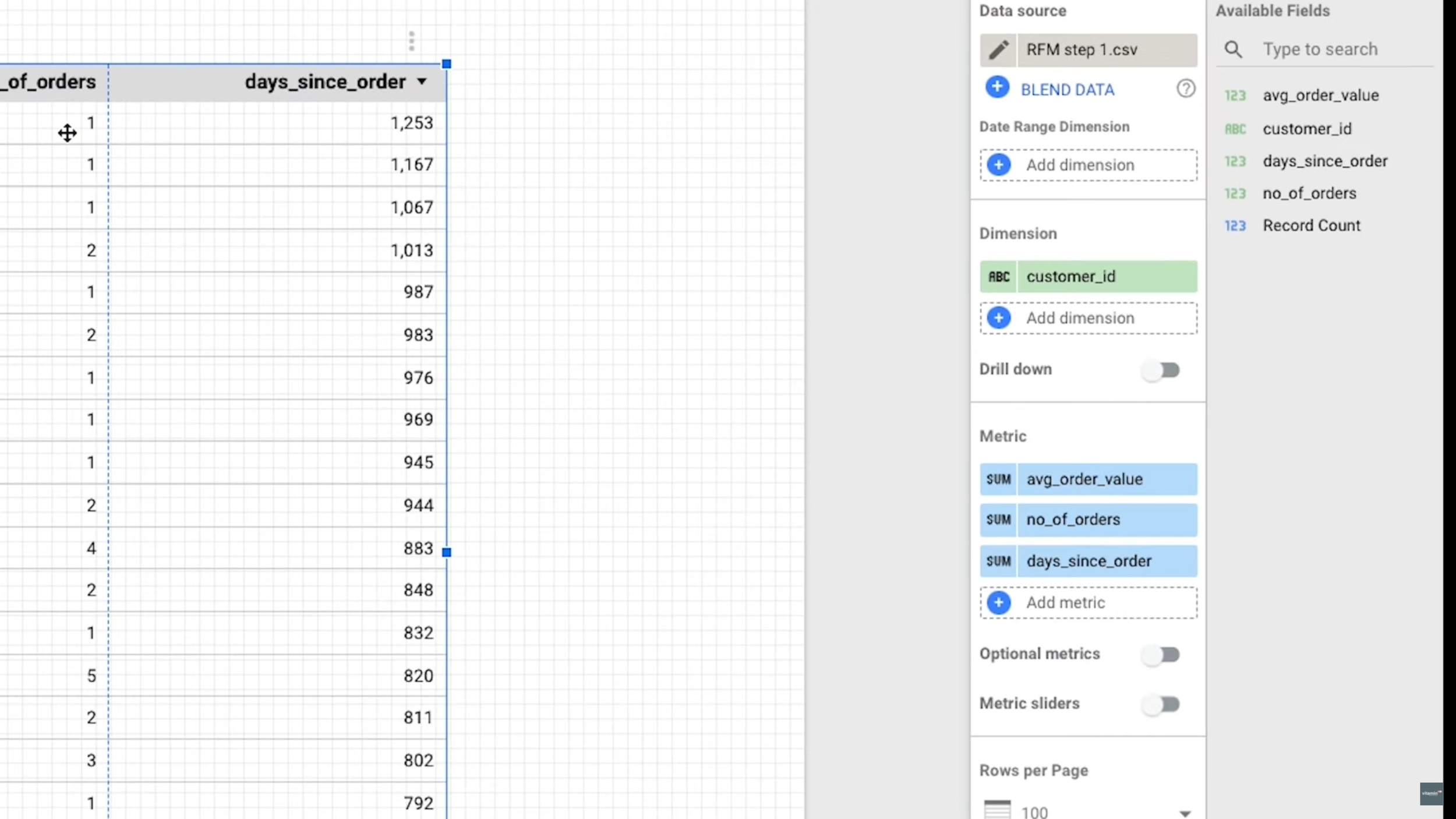
You would need to aggregate the data like before as the first step but, instead of going through the scoring with the PERCENTRANK.EXC function, we would need to calculate a number of days between the most recent order and today’s date. Easy to do using the DATEDIF function.
=DATEDIF(B2,TODAY(),”d”)B2 is the cell that contains the date and the “d” argument asks Excel to return the difference as a number of days.
N.B. Because the data set contains old data, the numbers returned by the formula are going to be larger than you’d expect.
Then just fill this down. In order to load it into Data Studio we’ll need to save it as a csv file (File>>Save as…).
Now go to Data Studio and create a new data source using the File Upload connector. Select the csv file and go through the guided process.
*If you don’t know how to do this, you can check out the free preview of The Ultimate Guide to Data Studio. You’ll need to enrol and then go to lesson 2.5 Creating your first data source.
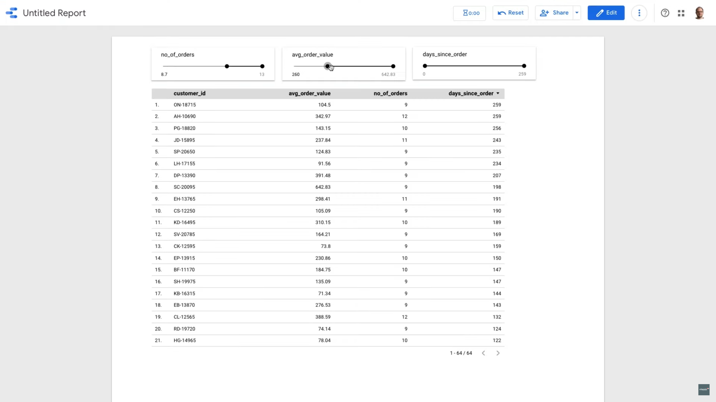
Then, in a new report, you would build a table putting customer id in dimensions and the recency, frequency and monetary columns into metrics.
Then you add 3 slider controls, one for each of the RFM metrics. Now you can use these sliders to filter the data, a bit like we did before, except we use the actual values instead of the scores we generated in excel.
You can then, if you want to, export the result to either csv or excel.
If you enjoyed this post, why not learn about Simple Regression Analysis here!


