Basic Predictive Analytics Using Simple Linear Regression
In this post I’m going to show you how to conduct some basic predictive analytics in Excel or Google Sheets using a technique known as linear regression. There’s some fairly complicated maths involved but the good thing is that you don’t really need to know any of it. Just how to interpret the results. Let me explain.
What is linear regression?
Ok, so first off, what is linear regression and how does it work? Well, simple linear regression, probably the most commonly used type of regression analysis, is used to create data models for predicting values we don’t yet have using data that we do have.
So, for example, we could use historical data to predict values in the future or, it could be something like predicting someone’s weight based on their height.
There are countless reasons why you might want to use linear regression but the simple premise is that we’re trying to create a formula that will help us predict values.
All you’ll need is 2 separate series of data that could potentially be correlated. During the analysis, we’ll test the strength of the correlation to see how well we’re able to predict values with the data we have.
We’re going to be working in Excel but you can also mostly do the same things in Google sheets which I’ll show you quickly later on. You can get your hands on the data set here if you want to follow along.
For our demonstration, what we’ll be doing is creating a scatter plot chart using 2 separate series of data for the x and y axes values.
Now, you don’t actually need to create a scatter plot to do what we’re trying to achieve but it’ll help you better visualise and understand how linear regression works.
Of the 2 series of data, one is called the dependent, or response, variable, which is the one that you want to predict. This is plotted on the Y axis. And the other is called the independent, or explanatory, variable which is plotted along the x axis.
Our independent variable is the budget for TV advertising in thousands of dollars. Our dependent variable is the number of sales made in thousands. So the idea here would be to see how closely correlated the budget is to the number of sales made.
To what extent is budget a reliable predictor of sales. And we have 200 rows in the data, or what are also called observations.
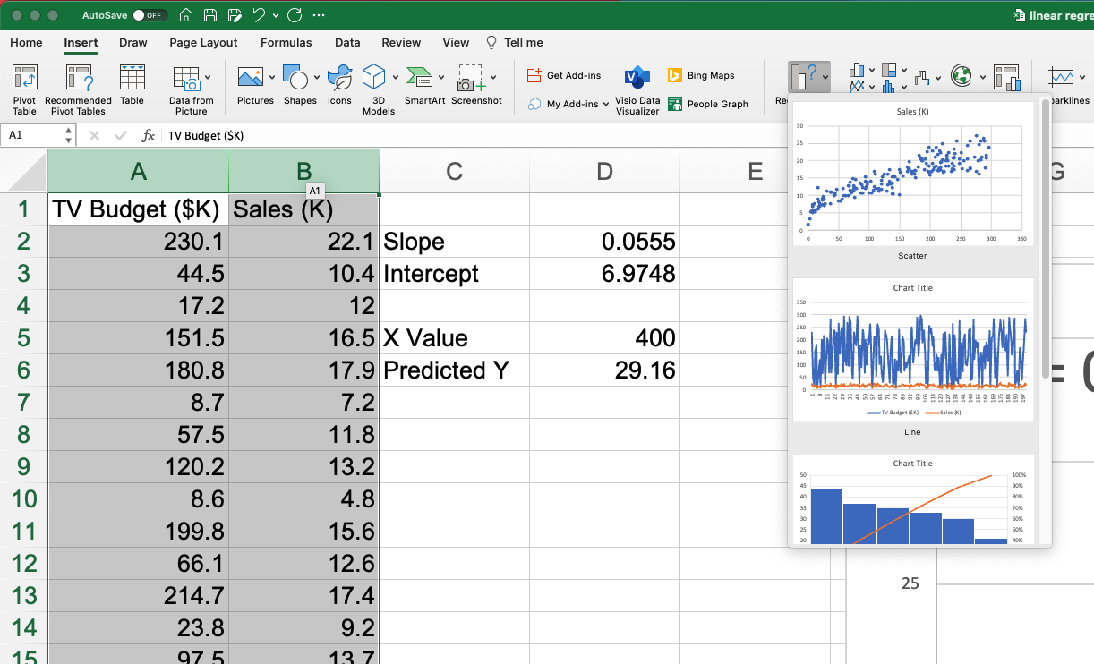
In Excel, we’ll start by selecting our 2 data series and then choosing ‘insert’ and ‘recommended charts’.
The first one is a scatter plot, which is what we’re looking for, so we’ll select that. When you do so, you should see the 200 observations plotted on the chart.
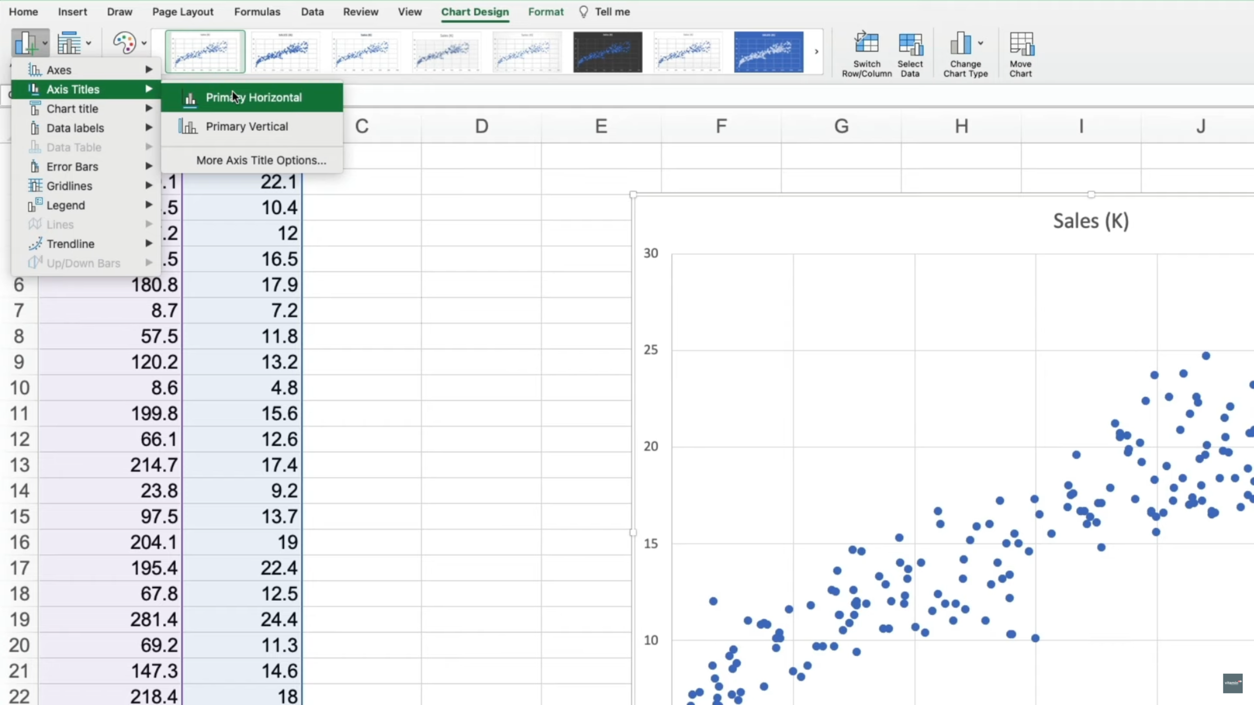
To make this easier to understand we’re going to need to add in axes titles which Excel doesn’t add for some reason, even though we’ve selected the column headers.
Anyway, you can add them by going to “Add chart element” and “Axis titles”, “Primary horizontal” which will be “TV budget in thousands of dollars” then for the primary vertical axis, it’s “Sales in thousands”.
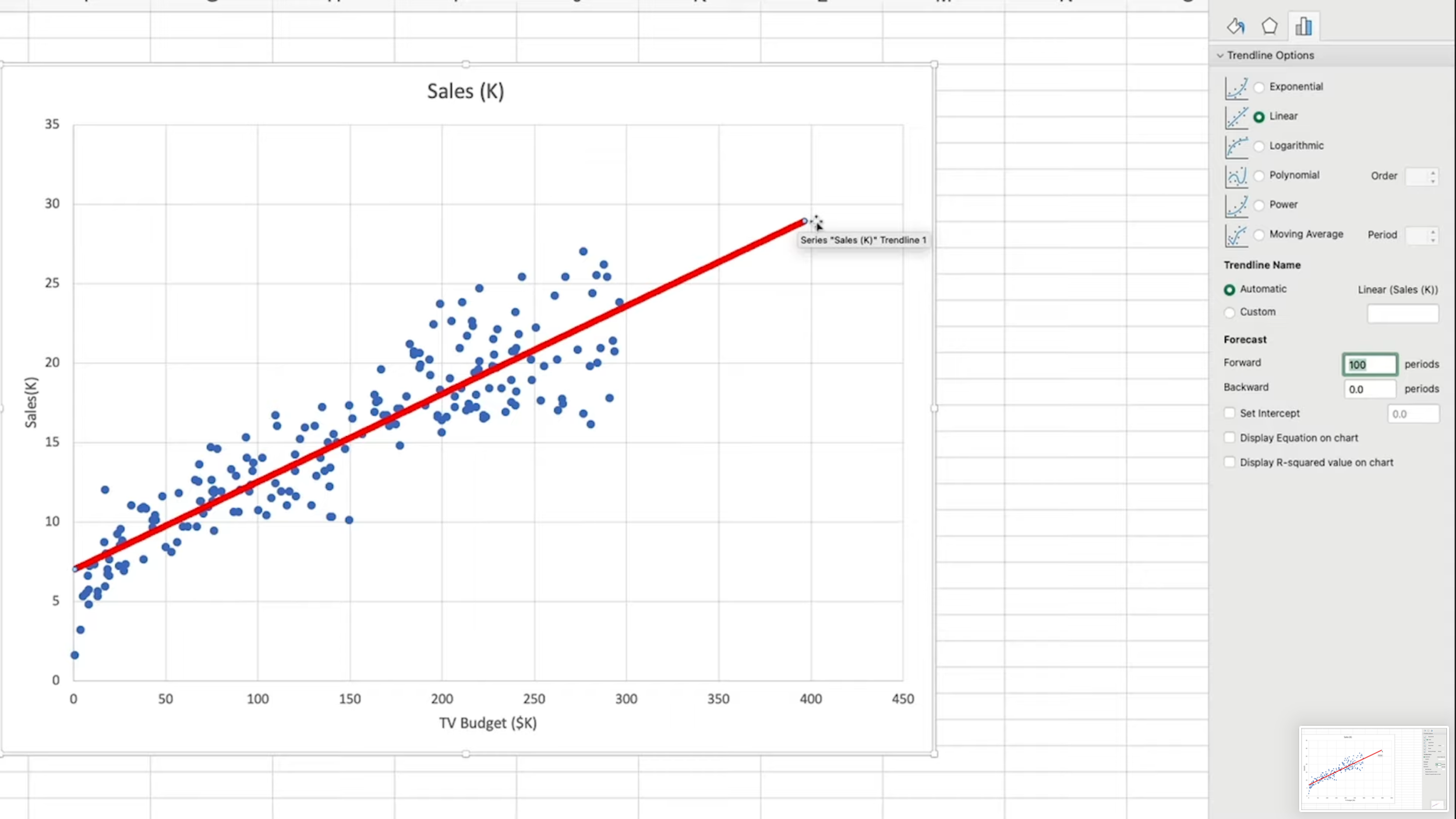
What we want to do next is to display a linear trend line on the chart, which is a straight line. You do this by right clicking any of the points on the chart and selecting “Add Trend line”.
You can make it stand out a bit better by formatting it to be red, making it thicker and also using a solid line.
So this trend line is also known as the line of best fit because it’s a line drawn that is closest to each of the points. Getting a bit more technical, it can also be described as the line that minimises the sum of the squared errors. It’s essentially the line that gives us an expected or predicted value of Y (in our case, Sales) for a given value of X (TV Budget).
On the right, you can even choose to forecast going forward and backward based on the observations we have. So, if I choose to go forward 100 periods, you can see the linear trendline continue and extend.
And, based on our 200 observations, we can predict that a budget of around 400 thousand would generate roughly 29 thousand sales. Let’s set that back to zero for now.
Ok, so this linear trendline gives us a visual representation of the expected values. But how is it calculated? Well, to see the formula for our linear regression, I can just select “Display equation on chart” from the options on the right. And you can also select “Display R squared value on chart” as well.
So, the equation gives us a way of calculating the Y value and it has 2 components, the slope value and the intercept value. If you want to know what these 2 components mean, the Slope will tell you the amount change in the dependent variable for every unit change in the independent variable
The intercept value is the predicted value for if the independent variable was at zero. Basically, this value here.
You can actually get these values by using excel functions. So, with slope, you use:
=SLOPE(B2:B201,A2:A201)And we can do the same for the intercept value using:
=INTERCEPT(B2:B201,A2:A201)Ok, so let’s use this formula to predict a Y value based on an x value. Earlier we forecast forward with our linear trendline to around 400. So we’ll use that as our X value.
Our formula for predicting our Y value is going to be Slope multiplied by our X value plus our intercept value.
=D2*D5+D3Which gives us 29.16. If you go back and add in the trendline forecast like before, you’ll see that our formula has given us the same predicted value.
R Squared value
But what about this R squared value? What does this signify?
The R squared value gives us a measure for how effective our model (or calculation) will be at predicting results.
It can basically be viewed as a percentage with the result being between 0 and 1 (or zero and 100 percent if you multiply it by one hundred).
It represents the proportion of the total variance in the Y values that is being explained by the x values.
I could go into more detail about how this is calculated with explained and unexplained variance from the mean, but this is just an introduction to basic linear regression so we won’t go there in this post.
In our model, we can see that the R squared value is around 81% which is quite high meaning that our formula is highly efficient at predicting our Y values. Because 81% of the variation can be explained by the values we have.
Google Sheets
So that was simple linear regression in Excel. You can do the same thing with Google sheets as well. Select the 2 columns, like in Excel, and choose Insert>>Chart. Sheets automatically chooses the scatter plot type and adds in the axis titles.
To show the formula just go to Customize>>Series>>Trend line. We can then change it to red and make it thicker. Then instead of “custom” for our label option, we can choose “use equation” and check R squared.
Sheets also has the same slope and intercept functions as Excel.
If you found this post useful, please comment and share it with someone you know who you think might like it too.


